
Parking just got easier
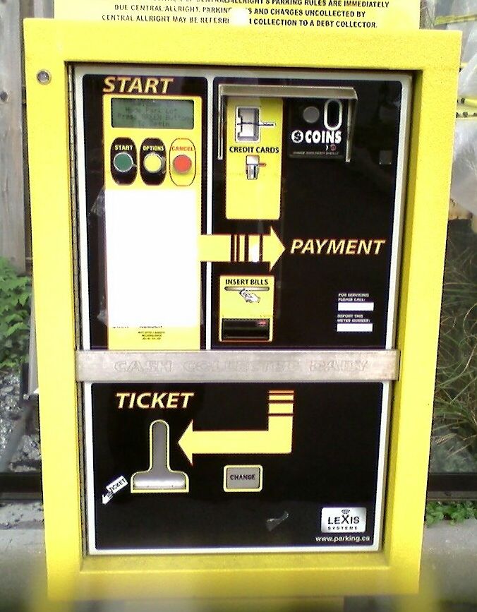
October 2006I was in Cincinnati last weekend visiting my brother and we ventured to the Hyde Park area to grab some dinner. We parked in an open lot behind the restaurant then walked towards a machine where we had to pay for the parking and receive a printed parking ticket.
As we approached I noticed a man struggling with the machine, inserting money and hitting the change return over and over. He shrugged at us, “I guess we’re out of luck.”
But the machine wasn’t broken per-se, it was just confusing. It doesn’t look confusing at all, with only 4 simple steps clearly printed on the front of the machine:
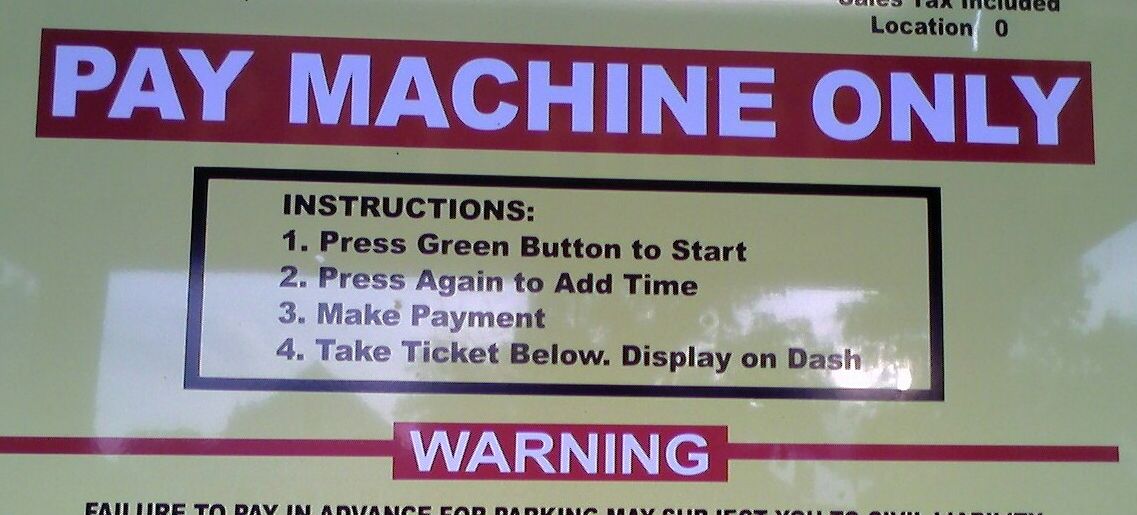
The man was following the steps verbatim, but wasn’t getting his ticket. I’m certain he repeated the process at least 5 times, with no change in results.
After a while my brother stepped up to the controls and tried to get it to work. No luck. Then we started to improvise, and the 5 of us standing around the machine each offered guesses as to what buttons to press.
After a minute or so, we got it to work. But we had to ignore Step 2 and add a few more steps before Step 4.
It’s not uncommon to run into poorly designed software, but I would think that a little more testing would go into designing an interface for a machine like this. The shame is that just a few simple changes to the text and interface would have made this a much better product.
I’m also certain that if the engineers who designed the interface watched the guy having trouble operating the machine, they’d achieve a better product. My guess is that they watched each other test it, and came up with the “easy” instructions.
Although I pick on the engineers who built this, I know most developers have made similar faux pas at times, myself included.
A funny thing though — the tag-line of the company who built this is, “Parking Just Got Easier.”
Was it really ever that hard to park?
[EDIT: Apparently I misread the company website as parking.com when it was really parking.ca.]